A Four-Panel Pop Explosion: How This Woman's Portrait Works
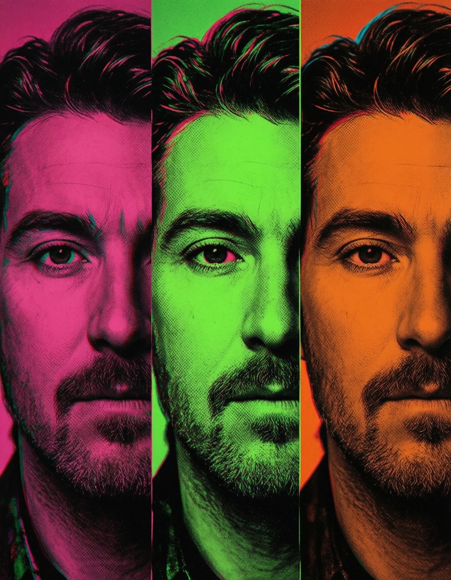
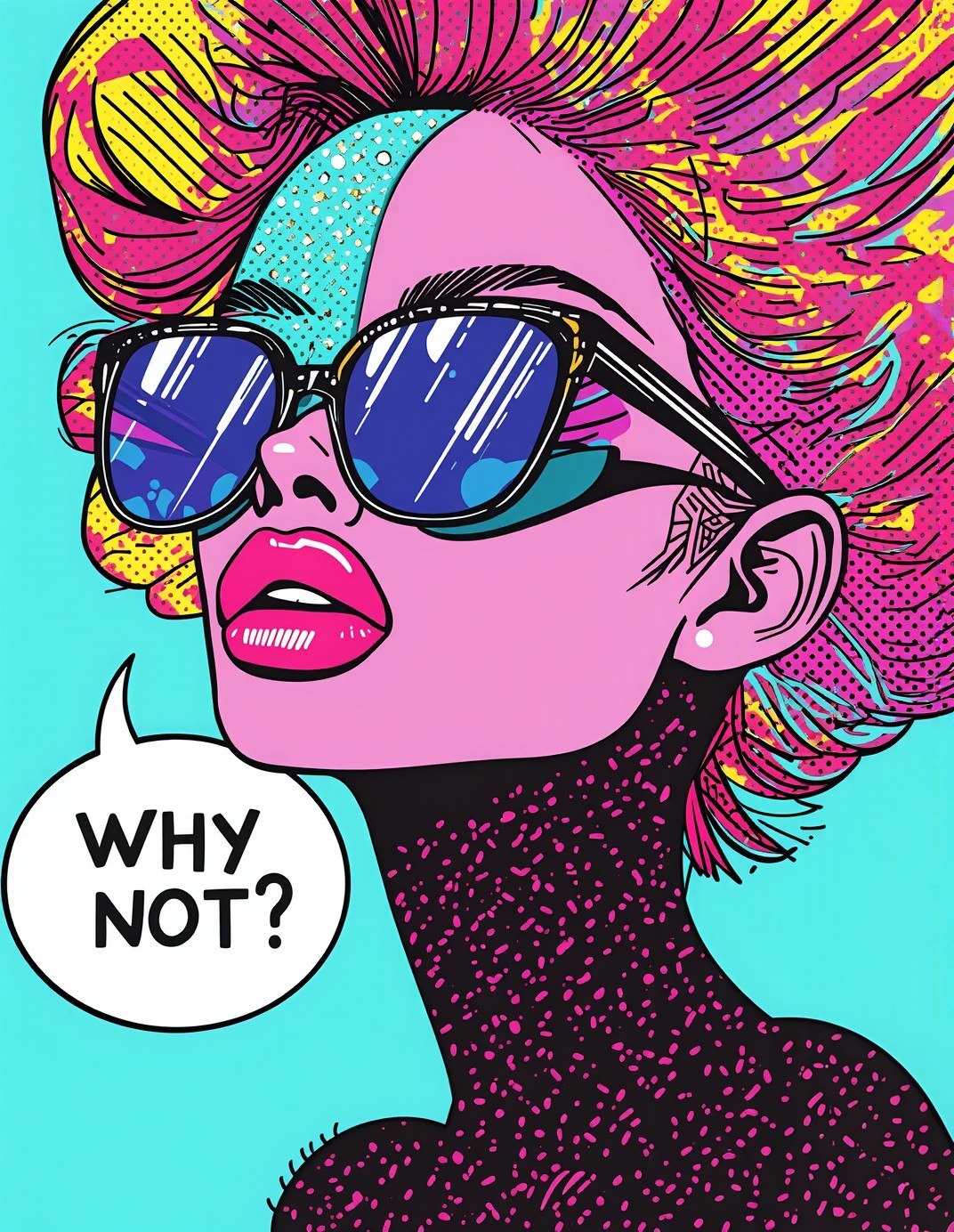
Imagine a face shattered into four color-blocked panels, each screaming with its own personality: electric blue, hot pink, sunny yellow, and mint green. Shuttle 3.1 Aesthetic takes this Warhol-meets-Lichtenstein concept and cranks it to 11, turning the subject into a living comic book. The oversized sunglasses are not just accessories—they're visual anchors that frame the chaos of the halftone hair explosion.
The speech bubble floating nearby ("WHY NOT?") isn't just text; it's a retro typography statement that completes the graphic novel aesthetic. The Ben-Day dots texture is rendered with such precision that you could almost feel the paper grain under your fingers. This is Pop Art reimagined for the digital age, where every element screams for attention.
Album Covers, Poster Art, and Digital Campaigns
This level of high-contrast, graphic-heavy output is perfect for music album covers, movie posters, and digital advertising campaigns that need to grab attention instantly. The 8k resolution ensures that even the smallest Ben-Day dots remain crisp when scaled up for print.
For best results, use a 3:4 portrait orientation to maintain the vertical drama of the four-panel face. Landscape crops would flatten the composition and lose the dynamic split-panel effect.
Settings for Shuttle 3.1 Aesthetic — Speed and Sharpness
Shuttle 3.1 Aesthetic is built on Flux.1 Schnell architecture, which means it can produce Flux Pro-level quality in just 4 steps. However, the high-contrast Ben-Day dots and thick outlines require careful parameter tuning:
- CFG / Guidance:
3.0–3.5— keeps the outlines sharp without over-saturating the colors - Steps: 4 for quick previews; 12–16 for full 8k resolution with perfect Ben-Day dot rendering
- Resolution:
1080×1440(3:4) — maintains the vertical panel drama;3840×2560for 4K output
At cfg 3.5 and 12 steps, the model preserves the Ben-Day texture without losing the speech bubble's retro typography clarity. Lower steps may cause the dots to blur.
Five Ways to Push the Pop Art Further
5 Targeted Variations for This Prompt
- Change the text: Replace "WHY NOT?" with "FUTURE IS NOW" — shifts the mood from playful to futuristic, ideal for tech branding
- Alter the color scheme: Replace "electric blue, hot pink, sunny yellow, mint green" with "neon purple, acid green, chrome gold, cyber orange" — gives it a cyberpunk twist
- Add a background: Add "gradient background with comic-style speech bubbles in the corners" — creates a full-page graphic novel panel effect
- Change the subject: Replace "woman" with "robot with glowing eyes" — transforms the portrait into a sci-fi icon with the same Pop Art style
- Adjust the panel layout: Change "four panels" to "nine panels in a 3x3 grid" — creates a more complex, mosaic-like composition
Two Prompts Ready to Generate
Apply two of the variations above directly — both are optimized for Shuttle 3.1 Aesthetic at the recommended settings:
Variation: Futuristic text, neon color palette — transforms the mood to tech-forward with glowing neon tones
Pop Art. A bold portrait of a robot with oversized sunglasses, glowing eyes, lips bright coral, hair exploding into a pattern of colorful comic-style halftone dots. Face split into nine panels in a 3x3 grid: neon purple, acid green, chrome gold, cyber orange, holographic blue, electric pink, neon yellow, mint green, and chrome black. Thick black outlines, Ben-Day dots texture, graphic novel aesthetic. Speech bubble floating near her reads "FUTURE IS NOW" in bold retro typography. Dynamic composition, high contrast, Warhol-meets-Lichtenstein style, 8k.
Variation: Gradient background with additional speech bubbles — creates a full-page graphic novel panel effect
Pop Art. A bold portrait of a woman with oversized sunglasses, her lips bright coral, hair exploding into a pattern of colorful comic-style halftone dots. Her face is split into four panels, each in a different vibrant color: electric blue, hot pink, sunny yellow, and mint green. Thick black outlines, Ben-Day dots texture, graphic novel aesthetic. Gradient background with comic-style speech bubbles in the corners, speech bubble floating near her reads "WHY NOT?" in bold retro typography. Dynamic composition, high contrast, Warhol-meets-Lichtenstein style, 8k.
More Pop Art Inspiration
These related prompts explore similar graphic styles and high-contrast compositions: