Exploding Soda Can in a Kaleidoscope of Color: The Pop Art Energy
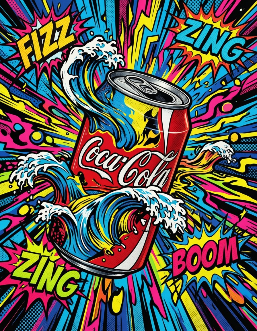
This isn't just a soda can — it's a visual supernova. The can's bold red and white curves rupture into neon yellow, electric blue, and hot pink waves that pulse outward like a cartoon explosion. Qwen Image 2512 captures the essence of 1960s Pop Art with its thick black outlines, Ben-Day dots, and comic-style onomatopoeia bursting from the scene. The vintage "POP!" logo feels like a relic from a retro ad campaign, while the dynamic energy suggests this could be the cover of a comic book or a psychedelic record sleeve.
The contrast between the can's crisp, vintage design and the chaotic, colorful explosion creates a tension that's both nostalgic and modern. It's the kind of image that could work as a mural, a poster, or even a smartphone wallpaper that demands attention.
From Packaging to Posters: Who Needs This Pop Art?
Graphic designers working on retro-themed campaigns, beverage brand identity projects, or album art will find this prompt invaluable. The still life format works especially well for print media — think magazine spreads, vinyl records, or even restaurant menus with a playful twist.
For best results, use a square (1:1) or horizontal (16:9) aspect ratio to balance the explosive energy with the can's vintage form. Avoid vertical crops that might truncate the radiating color waves.
Settings for Qwen Image 2512 — Stability Meets Vibrancy
Qwen Image 2512 handles complex text and detailed patterns exceptionally well, but its high-resolution output requires careful parameter tuning:
- CFG / Guidance:
3.5–4.0— preserves text clarity without over-saturating colors; lower values risk losing the Ben-Day dot texture - Steps: 30 for full 8K detail; 12 steps for quick previews
- Resolution:
8192×8192(native square) — ideal for maximal Ben-Day dot detail; 4096×4096 for balanced quality/performance
For maximum stability, rewrite the prompt to include "high-resolution Ben-Day dots, precise comic text, 8k" — Qwen Image 2512 responds well to explicit resolution and style cues.
Five Ways to Rethink This Pop Art Explosion
5 Targeted Variations for This Prompt
- Subject swap: Replace "soda can" with "record player" — the explosion becomes a vinyl record shattering into sound waves, retaining the same color palette
- Color shift: Change "neon yellow, electric blue" to "pastel pink, mint green" — softens the energy into a more whimsical, candy-themed aesthetic
- Text rework: Replace "FIZZ, ZING, BOOM" with "WHIRL, SPIN, TWIST" — transforms the explosion into a dance move or music video concept
- Style adaptation: Add "manga-style linework, gradient fill" — shifts from classic Pop Art to modern anime-inspired design
- Cultural twist: Replace "vintage logo" with "Japanese kanji for 'energy'" — merges Pop Art with contemporary Japanese street art motifs
Two Prompts Ready to Generate
Apply two of the variations above directly — both are tuned for Qwen Image 2512 at the settings recommended above.
Variation: Record player explosion — same energy but with vinyl and sound wave motifs
Pop Art. A vibrant still life of a classic record player exploding with colorful waves, vintage logo reading \"VINYL!\" in script. Abstract shapes in neon yellow, electric blue, and hot pink radiate outward like sound waves. Comic-style onomatopoeia text: \"WHIRL\", \"SPIN\", \"TWIST\". Thick black outlines, Ben-Day dots, retro pop art aesthetic, 8k
Variation: Pastel color shift — softens the explosion into a candy-themed aesthetic
Pop Art. A vibrant still life of a classic soda can exploding with pastel waves, vintage logo reading \"POP!\" in script. Abstract shapes in pastel pink, mint green, and lavender radiate outward. Comic-style onomatopoeia text: \"FIZZ\", \"ZING\", \"BOOM\". Thick black outlines, Ben-Day dots, retro pop art aesthetic, 8k
More Pop Art Adventures
Explore similar prompts that push Pop Art in different directions — from portraits to vehicles and fashion: